Tuesday, November 30, 2010

Xerox b/w Marriott

I'm perfectly willing to admit that maybe it's just me. Maybe I'm tired and preoccupied, and I'm overlooking all sorts of instances of great design all around me. It's definitely a possibility. But then again, maybe it's the case that most design I see just sucks (haphazard layout, no consistency in type or illustration, lack of direction), and the reason I'm not finding anything excellent is because there isn't any to be found. So here's a Xerox ad from Time Magazine, the strength of which comes almost entirely from a cleverly conceived photo.


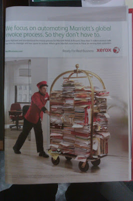
The photograph here works because it's absurd and counterfactual, while still being relevant. Xerox, in this ad, is priding itself on the digital invoice system it created for Marriott hotels. Obviously that's a lot of data that needs to be moved around, and in hard copy it probably would look like vast stacks of variously colored papers, folders and binders. But how to invoke the hotel theme, since this is Marriott we're talking about? It's obvious: A red-clad bellhop pushing a luggage cart, because that's how we perceive things being moved around in hotels. The unspoken message of the photograph, barely touched on by the ad's text, is "If not for our data management systems, Marriott would have to resort to this impractical and ridiculous-looking method."

But other than that, I'm not a big fan of the design in this ad. The text is too light-weight and awkwardly positioned. The Xerox logo is in a weird place that doesn't draw the eye. That big chunk of white space between the URL and the slogan is just sitting there.

Maybe today just isn't a good design day in my world.

Sunday, November 28, 2010

ID, Ps and Ai in concert

By class time, Monday, November 29th, post a blog about how you would use all three programs, InDesign, Photoshop and Illustrator together to produce a newsletter. Think about the newsletter you produced for 502. How you would you [sic] use each program to produce your final product?

It doesn't take much creative thinking to use these programs to produce a newsletter, since that's exactly the sort of project for which they were created. All you have to do is know which program is best suited for which task: Photoshop is for creating and editing raster images such as photographs, Illustrator is for creating and editing vector images, and InDesign is for layout.

If your newsletter needs a logo or masthead design, Illustrator is the program to use. If I had had more (read: any) experience with Illustrator when I was working on The Bleeding Edge for 502, I would have used it to create the masthead instead of doing it entirely in InDesign.

Photoshop, as its name implies, is most likely to be used for processing and editing photographs. You probably have some that you want to use, but the colors may be washed out or similarly imperfect. You can use Photoshop for quick and easy color correction and make the whole newsletter look better, just as I did on the 502 project.

Finally, once all of your graphic work is done, you can bring it into InDesign. InDesign will let you set the text and produce whatever layout you want, arranging it with images and making it all look nice. Naturally that's what I used for the layout of The Bleeding Edge.

So it's not a big deal to use these programs for a newsletter. It's just a matter of knowing which is the right tool for the job.

Tuesday, November 16, 2010

Apple Redux

This assignment wasn't easy for me, since most of the well branded companies I admire are too small to advertise outside of their fields. (I love your logo, Raw Dog Screaming Press!) So I'm recycling content and using an ad I already discussed in this post back in September, but Apple is a very well branded company and this ad makes good use of that. I'm going with it.


This particular ad relies on the viewer's familiarity not only with the brand, but with the product. There's very little specific information in the ad, only what's necessary to point out the new feature. Instead, we see the iPhone, and we're meant to instantly recognize it and know who produces it, which is why the Apple logo itself only appears, small, at the bottom of the page. That's a perfectly valid choice for a brand as established as Apple, though. Assuming the viewer's familiarity and skipping the introductions sends an air of confidence. Apple wants to be seen as both familiar and strong, and that comes through in this ad.

Tuesday, November 9, 2010

Good logos, bad logos


The Sherwin Williams paint logo has always been one of my favorites, just because of its boldness of concept. What other corporate logos come right out and say "We want to conquer the entire planet"? They're not even carefully brushing the paint on the globe, either; they're just dumping the whole can. It's brash and unforgettable, while still remaining relevant to the company's actual product. If Sherwin Williams ever rebrands to something shiny and abstract, I will be a very sad fellow.


Good old Amazon. The smile/arrow has become one of the most iconic images of online commerce, recognizable even when separated from the company name. As a smile, it evokes positive emotion, and as an arrow it relates to travel and movement, very much a part of Amazon's shipping-based business model. But it becomes even more impressive as part of the full logo, because of something I didn't even notice for years. Look at where the arrow begins and ends. That's right: it travels from A to Z. It encompasses everything, just like Amazon's inventory. What a brilliant concept.


This... this is not so good. Remember America Online? Turns out the company still exists, and they recently tried to rebrand as "Aol." And yes, the period is part of the name. (How do you even pronounce that? "Owl"?) To make an Aol. logo, apparently you just print the name in white Helvetica, knocked out of whatever stock photo you have lying around, and you're done. Other companies have succeeded with variable, dynamic logos before, but this conveys absolutely no information about what the company does. Worse yet, it may even convey less than nothing, since it gives the impression that not even the company itself knows why it exists. (Something to do with goldfish?)


And finally, the infamous logo of Brazil's Institute of Oriental Studies, widely considered to be one of the worst logos of all time. Technically it's not so bad; the colors aren't too garish, and the simple linework means that it's easily scalable. It does, however, violate one of the most fundamental rules of logo design: Don't make your logo look like something obscene is going on. If you can look at this logo and see nothing but a pagoda in front of a setting sun, well, I envy your innocence.

Tuesday, November 2, 2010

Good color, bad color


More horror, hooray! This is a card advertising an independent movie, and I thought the color choices were pretty effective. I wish the image were better, but once again I'll make do. This card uses the typical "horror palette" of black, white and red, but the exceptional brightness of the fork draws the eye. The remainder of the card is relatively subdued, and I think the contrast between the shining fork and the dim text adds some tension and keeps the viewer engaged.


This is actually the backside of the "Scream Freak" card from this post, and it's just plain ugly. The colors are obscenely bright, and the contrast along some edges is painful to look at, causing a "vibration" illusion in some spots. Of course, this is the printer's self-promoting side of a free card, so perhaps it functions as a sort of extortion: "Pay up, and we won't put this hideous thing on the back of your postcard!"

Saturday, October 30, 2010

Making a distressed rubber stamp image in InDesign and Photoshop

This is the technique I used to create a ragged, distressed rubber stamp effect on my newsletter project. Credit goes to the author of this blog post for getting me started, although my method isn't exactly the same.

First, use InDesign to create your "stamp." I chose to do this in InDesign because it's more suited for manipulating text and geometric shapes than Photoshop is.


If you're going to use this in a printed project, you'll next have to blow it up really big. I used Transform > Scale at 600%, which ought to be plenty.


It's huge! Copy it onto the clipboard, launch Photoshop and create a new document. The dimensions of the document should scale automatically to the image on the clipboard, which is exactly what you want. Make sure the resolution is set to 300 dpi, and create your blank Photoshop document. Paste the image in (this creates a new layer, called Vector Smart Object, automatically), double-click it to set it down, and choose the command Layer > Rasterize > Smart Object. This turns the vector image into a form that you can now edit pixel by pixel.

Once that's done, select your eraser tool, make sure it's set to pencil mode (to make nice, crisp scratches) and call up a nice distressed brush. Don't have one? Download some nice ones for free, right here. I used the brushes in this set.


Now go hog wild with the scratch images at your disposal. Don't drag them; just click them once in place. Mix them up, change the sizes and place them all over until you're satisfied.


Once you're done, go into the Layers window. You should see two layers: Vector Smart Object, with your illustration, and Background, which is blank. Drag Background to the trash can. This removes the white background and leaves the design transparent.


You're done. Save the illustration as a TIFF file, including transparency.


That's it. You've got a lovely, ugly, high resolution rubber stamp image, ready to place into an InDesign document on any background color or image for all your TOP SECRET, CONFIDENTIAL and FIND HIM AND KILL HIM needs. Enjoy.

Tuesday, October 26, 2010

Dash Seafood, Chicken & Pizza


I considered various examples of folding media from MAD to Playboy, but in the end settled on this humble carry-out menu. What interested me is that it's not divided evenly: the sheet is 11" by 17", and it's folded into three 11" by 4" panels and one 11" by 1" strip. When the menu is folded and you turn over the first "page," that additional strip sticks vertically out of the center, as seen above. The natural response is to grasp it and pull, which opens up the next panel. Whether this was deliberate or not, it's very intuitive. It actually makes the menu easier to handle than if it were divided into three even panels. And while the extra strip may seem disruptive to the overall shape, this is mitigated by visually separating it from the rest of the menu, as it consists almost entirely of one-inch-wide coupons. It looks like a sidebar, something related but separate from the whole.

Tuesday, October 19, 2010

Dewey Defeats Truman


This, of course, is the legendary November 3, 1948 edition of the Chicago Daily Tribune. It's an example not only of the dangers of rushing to press, but also of obvious grid design.

Newspapers almost always have clearly identifiable grids, as a standardized grid structure makes it much easier to lay out the publication in limited time. This was even more true in the era of Linotype, before computers automated much of the process. In the Daily Tribune, we see a very straight, column-based grid into which any sort of articles can be slotted with minimal effort.

What I find most interesting is the number of columns. While six columns is usually the maximum you'll find today in any type of publication (the Baltimore Sun currently bases its grid around four columns), here we have eight. This allows the paper to save space by laying the headlines across the top and letting them serve almost as an index: scan from left to right to find the article you want to read, and then proceed down. The drawback is that the columns are exceedingly narrow and the page becomes quite dense with text, but this was much less of a concern at a time when the primary mission of a newspaper was to convey information to its readers.

[Image via Todd And(rlik)]

Tuesday, October 12, 2010

Regaining the Rainbow


It was remarkably difficult to find a well designed magazine article. My first target was Time, copies of which abound at the office, but looking at it with a designer's eye produced disheartening results. I saw little attention to the rule of thirds, photos and pull quotes scattered haphazardly and questionable white space.

My wife came to my rescue, though, when she found me an issue of Scientific American Mind. This is respectable design here. The article uses a classic three-column layout, very popular for magazines because short line lengths are easy for the eye to take in, and the addition of thin lines between columns also helps guide the reader. The serif body font, which helps carry the eye from one character to the next, is printed in just about the perfect size: small enough to prevent the phrases from becoming choppy, and large enough to ward off eyestrain.

I don't generally like pull quotes, as I find them disruptive and redundant, but putting one at the top of the right-hand page acts almost like a second headline to attract attention. This works very well because it grabs a casual page-turner, but then becomes unobtrusive and out-of-the-way when you start to actually read the article. The section headings are in a different color and a contrasting sans-serif font, and they add some needed texture without being distracting.

Monday, October 11, 2010

ID IRL

The grounding I've received in InDesign from PBDS 501 has pretty much single-handedly made it possible for me to do the assignments in PBDS 502, so if this assignment is an attempt to get feedback on an unasked question about curriculum design, then yes, starting the semester with InDesign was definitely the right choice.

As I've said before, InDesign is good software in its own right, and it's the industry standard, so using it for the graphic design assignments in the other class only makes sense. It allows me to get the hands-on, goal-oriented experience I need to become not only knowledgeable about the software, but comfortable with its use.

And because InDesign is such good software, and so well suited to its task, it makes it easier to be creative in the assignments. I've started taking more risks and being more experimental, trying to find which approaches are most successful, because I know that if something doesn't come out right I can scrap it and start over without wasting too much time. I'm glad to gain the experience.

Tuesday, October 5, 2010

Type-Only Solutions


"Successfully" uses type only as a solution, eh? I suppose it all depends on your definition of success.

The item on top was yet another advertising card left on a table. It does, indeed, succeed in informing me of the existence of ScreamFreak.com, but it does not succeed in telling me what it is, or giving me any reason to want to go there. (If you don't feel like following the link, it's a crudely designed site about Halloween haunted houses in Virginia.) I do like the design of the text, though. The font for "Scream Freak" is tall, uneven and distressed, which brings a very clear Halloween/horror message, and the yellow letters with a red glow on the black background really pop nicely. I just wish that the card had given me more useful information at first glance. (Incidentally, the reverse is a brightly colored ad for the company that printed the card for free.)

The lower item is a bumper sticker I borrowed from my wife, a big fan of the color purple (no connection to the Ravens). The all-text design works in this case, since it's meant to be seen on a car, and adding illustration would only make the message harder to read. The background is purple (because what other color could it be?) and the text is white, which contrasts clearly and legibly. I might, however, have picked a different font, perhaps something without serifs, to make it even clearer at a distance.

Tuesday, September 28, 2010

Creative Concepts

These two technology ads from Time Magazine have similar concepts and palettes, but they use strong creative concepts to call attention to the strengths of the devices.


The Kindle hasn't quite made it into the mainstream consciousness yet--I've only seen one or two in the wild--so what better concept for an ad than to simply show the device itself at full size? The reader gets a good, uninterrupted look at the Kindle, with a human hand for scale, surrounded by the features Amazon wants to promote. I also give the designer credit for the text shown on the Kindle's screen, as Ellison's Invisible Man has a very strong prologue that draws the reader in. Displaying that text legibly on the screen of the Kindle in the ad encourages you to read it, and when it cuts off in the middle of a sentence you're left wanting more. The designer has thus created an unconscious connection between the Kindle and feelings of desire and unfulfillment, which is a very successful way to sell anything.


The iPhone, by contrast, is well established, and the ad doesn't need to explain the basics of the device. Instead, it draws attention to the new forward-facing camera by showing two iPhones facing each other. (Of course they're both cheated outwards for visibility, but they're supposed to be read as parallel.) We see the boy and the man talking to each other as if they were in the same room. iPhone's new video call feature, the ad says, is just as good as being face to face.

Tuesday, September 21, 2010

Symmetrical and Asymmetrical Design

The assignment didn't specify we had to post good examples of symmetrical and asymmetrical balance, and this is what I had lying around. It'll do.


Here are two samples of really boring symmetrical balance. On both cards the text is centered, and that's about it. The Horror Realm card has a bulleted list of five attractions, which is broken up into two side-by-side pairs with the fifth centered below, making that portion symmetrical as well. The symmetry on both cards makes for clarity and legibility, but it fails to catch the eye.


This promotional card for The New Vampire's Handbook, on the other hand, tries for asymmetrical balance but doesn't do it very well. The large red image on the left carries more weight than the text does on the right, and it unbalances the card, drawing the eye away from the text more than it should. To fix this, I would start by printing the text in a much bolder typeface and taking up more of the black space.

Wednesday, September 15, 2010

Adobe InDesign CS5: First Impressions

I haven't had much experience with this sort of software, but I'm a fairly quick learner, so I wasn't too worried. On first glance, InDesign looked intimidatingly complex, with thousands of tiny unlabeled buttons all over the place, but a little bit of handholding showed me the secret: redundancy. There's a lot of it. Most common functions in ID, it seems, have about six different ways that you can do them, so as long as you know one method of doing what you want you don't even have to worry about the other interface options. After spending more time with it, I've reached the conclusion that ID is really excellent software, despite the learning curve. It's complex but intuitive, and very responsive; I haven't found anything significant to complain about yet.(Of course, I have yet to use the notorious pen tool, so I may change my mind later.) As it is, I'm becoming more comfortable with ID by the day. I hope to have it jumping through hoops after a few months.

Monday, September 13, 2010

Glow Sticks


I boosted the saturation on this photo to better portray the day-glow colors, but I think I may have overdone it a bit. Oh, well. I'm posting this flyer to point out its use of a couple of the basic principles of design, namely repetition and alignment.

The photo boxes make good use of repetition. Each is the same size, with the same colors in the border, background and text. It's obvious they're meant to be considered as a group, each presenting a different example of the products this company sells, and none is more important than any other. It may be unimaginative, but it conveys the message efficiently.

But something interesting shows up when we look at those same boxes in terms of alignment. We expect them to be lined up, evenly spaced and aligned at the top and bottom, but they're not. Each box is slightly tilted at a different angle. The designer of this flyer, I think, is deliberately subverting the usual rules of alignment in order to better evoke sensations of fun and excitement. That strikes me as a pretty good idea when you're selling glow sticks.

Sunday, September 12, 2010

I Am Ten Ninjas


I like this t-shirt, by R. Stevens of the webcomic Diesel Sweeties, and I couldn't help but notice that it plays with figure and ground in a very similar fashion as the Haunted Gettysburg Ghost Tours flyer. In this case, we see a mostly self-contained oblong shape, which under most circumstances we would perceive as figure against the (black) ground. Closer inspection reveals that it's the visible portion of a ninja's face, and once we recognize that, the blackness surrounding it becomes the ninja's cowl, which in turn bleeds off into the blackness of the shirt without any delineation and becomes the ground again. The figure/ground distinction is further confused by the caption, which is printed as unambiguous figure on the black ground, but if we take into account the evident location of the ninja then the text must be printed on, or floating in front of, his face. It is, as they say, a mystery.

Wednesday, September 8, 2010

Disagreeing With the Professor

In this blog post, Megan posts a LensCrafters ad as an example of good design:


She says, "it is subtle and inviting. the monochromatic color scheme draws you in and allows their use of icon to stand out." I'm sorry, but I have to disagree with this one. That blue palette looks way too much like the color correction scourge that has plagued Hollywood horror movies in recent years: 5 Annoying Trends That Make Every Movie Look The Same. I've developed an almost Pavlovian response to it. Where Megan sees "subtle and inviting," I see a really bad remake of Village of the Damned.

(And what do you know? There already was one.)

Monday, September 6, 2010

Apollo Civic Haunted Theatre & Ghostly Images of Gettysburg


...and now for two examples of bad design. The colors are a big problem for both of these, not because they clash, but just because they're clichéd. If I had a nickel for every time I've seen red and white on black used as the default color scheme for horror, I wouldn't have needed a student loan.

I'm no exemplar of originality, of course. Indeed, this is the color scheme of MicroHorror.com, and I have no-one to blame but myself. However, unlike the designers of these flyers, I took steps to reduce the contrast between the colors, in order to mitigate the eyestrain that this scheme can sometimes cause. Especially on the Ghostly Images of Gettysburg flyer, looking at the bold white text for more than a few seconds makes me see annoying afterimages, but turning the black to a dark gray and the white to a light gray reduces the contrast and makes it easier to look at.

I also have to criticize the typeface choices. Both flyers use Microsoft's Chiller, which I saw grossly overused this weekend. I love distressed horror typefaces, and Chiller isn't intrinsically bad, but its impact is reduced by its ubiquity. Even worse is the use of Comic Sans MS, a typeface which is both overused and poorly designed. Seeing that alone makes it impossible for me to take Ghostly Images of Gettysburg seriously.

Hayman Farms


I like this one because of the color selections, so I apologize for the poor photography. The palette of the background makes use of soft, almost neutral earth tones: brown, beige and orange. The bat motif is incorporated subtly into the design of leaves and abstract swirls over burlap, which is a refreshing change from the garish, in-your-face style of a lot of Halloween event design. In fact, the subtle bats are my favorite part of the whole thing, for this very reason. (Have you heard my new band, The Subtle Bats?)

The logo and text are printed boldly, but not starkly, on top of the background, with the text inside a translucent block that calls attention to itself while remaining easy on the eyes. The logo itself evokes, if not downright parodies, the horizon motif of Barack Obama's campaign logo, and makes use of a pleasantly complementary autumnal palette of greens and oranges.

I admire whoever designed this brochure. Really, it's very well done.

Saturday, September 4, 2010

Haunted Gettysburg Ghost Tours


As I expected, there's a ludicrous quantity of printed ephemera being tossed around at this convention, so I have plenty of fodder for this design blog, and you get to see me use spooky and horror-related examples for the foreseeable future. Lucky you.

I'm not very impressed by most of this card, mainly because it contains too many fonts used inconsistently. Despite this, I really like the logo up at the top. It's a perfect example of reversible figure and ground, as the churchyard appears as a black silhouette, but the blackness then extends seamlessly downwards and becomes the stable ground against which we read the text. The presence of the eyes in the logo makes it even more ambiguous, because we can't determine whether we're seeing a face with a churchyard in front of it or giant eyes floating in the sky. Even if the rest of the card is flawed, the logo is very good design in my book.

Thursday, September 2, 2010

Hello, world.

Blog created. Next step, content. I'm sure I'll find all sorts of interesting (and "interesting") design this weekend.