Saturday, October 30, 2010

Making a distressed rubber stamp image in InDesign and Photoshop

This is the technique I used to create a ragged, distressed rubber stamp effect on my newsletter project. Credit goes to the author of this blog post for getting me started, although my method isn't exactly the same.

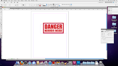
First, use InDesign to create your "stamp." I chose to do this in InDesign because it's more suited for manipulating text and geometric shapes than Photoshop is.


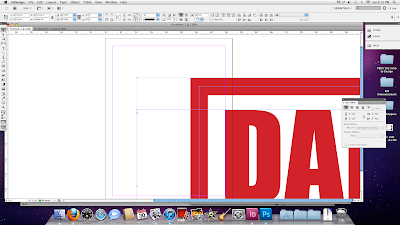
If you're going to use this in a printed project, you'll next have to blow it up really big. I used Transform > Scale at 600%, which ought to be plenty.


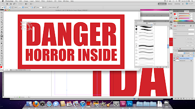
It's huge! Copy it onto the clipboard, launch Photoshop and create a new document. The dimensions of the document should scale automatically to the image on the clipboard, which is exactly what you want. Make sure the resolution is set to 300 dpi, and create your blank Photoshop document. Paste the image in (this creates a new layer, called Vector Smart Object, automatically), double-click it to set it down, and choose the command Layer > Rasterize > Smart Object. This turns the vector image into a form that you can now edit pixel by pixel.

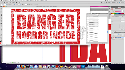
Once that's done, select your eraser tool, make sure it's set to pencil mode (to make nice, crisp scratches) and call up a nice distressed brush. Don't have one? Download some nice ones for free, right here. I used the brushes in this set.


Now go hog wild with the scratch images at your disposal. Don't drag them; just click them once in place. Mix them up, change the sizes and place them all over until you're satisfied.


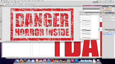
Once you're done, go into the Layers window. You should see two layers: Vector Smart Object, with your illustration, and Background, which is blank. Drag Background to the trash can. This removes the white background and leaves the design transparent.


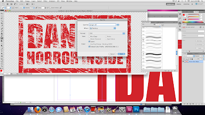
You're done. Save the illustration as a TIFF file, including transparency.


That's it. You've got a lovely, ugly, high resolution rubber stamp image, ready to place into an InDesign document on any background color or image for all your TOP SECRET, CONFIDENTIAL and FIND HIM AND KILL HIM needs. Enjoy.

Tuesday, October 26, 2010

Dash Seafood, Chicken & Pizza


I considered various examples of folding media from MAD to Playboy, but in the end settled on this humble carry-out menu. What interested me is that it's not divided evenly: the sheet is 11" by 17", and it's folded into three 11" by 4" panels and one 11" by 1" strip. When the menu is folded and you turn over the first "page," that additional strip sticks vertically out of the center, as seen above. The natural response is to grasp it and pull, which opens up the next panel. Whether this was deliberate or not, it's very intuitive. It actually makes the menu easier to handle than if it were divided into three even panels. And while the extra strip may seem disruptive to the overall shape, this is mitigated by visually separating it from the rest of the menu, as it consists almost entirely of one-inch-wide coupons. It looks like a sidebar, something related but separate from the whole.

Tuesday, October 19, 2010

Dewey Defeats Truman


This, of course, is the legendary November 3, 1948 edition of the Chicago Daily Tribune. It's an example not only of the dangers of rushing to press, but also of obvious grid design.

Newspapers almost always have clearly identifiable grids, as a standardized grid structure makes it much easier to lay out the publication in limited time. This was even more true in the era of Linotype, before computers automated much of the process. In the Daily Tribune, we see a very straight, column-based grid into which any sort of articles can be slotted with minimal effort.

What I find most interesting is the number of columns. While six columns is usually the maximum you'll find today in any type of publication (the Baltimore Sun currently bases its grid around four columns), here we have eight. This allows the paper to save space by laying the headlines across the top and letting them serve almost as an index: scan from left to right to find the article you want to read, and then proceed down. The drawback is that the columns are exceedingly narrow and the page becomes quite dense with text, but this was much less of a concern at a time when the primary mission of a newspaper was to convey information to its readers.

[Image via Todd And(rlik)]

Tuesday, October 12, 2010

Regaining the Rainbow


It was remarkably difficult to find a well designed magazine article. My first target was Time, copies of which abound at the office, but looking at it with a designer's eye produced disheartening results. I saw little attention to the rule of thirds, photos and pull quotes scattered haphazardly and questionable white space.

My wife came to my rescue, though, when she found me an issue of Scientific American Mind. This is respectable design here. The article uses a classic three-column layout, very popular for magazines because short line lengths are easy for the eye to take in, and the addition of thin lines between columns also helps guide the reader. The serif body font, which helps carry the eye from one character to the next, is printed in just about the perfect size: small enough to prevent the phrases from becoming choppy, and large enough to ward off eyestrain.

I don't generally like pull quotes, as I find them disruptive and redundant, but putting one at the top of the right-hand page acts almost like a second headline to attract attention. This works very well because it grabs a casual page-turner, but then becomes unobtrusive and out-of-the-way when you start to actually read the article. The section headings are in a different color and a contrasting sans-serif font, and they add some needed texture without being distracting.

Monday, October 11, 2010

ID IRL

The grounding I've received in InDesign from PBDS 501 has pretty much single-handedly made it possible for me to do the assignments in PBDS 502, so if this assignment is an attempt to get feedback on an unasked question about curriculum design, then yes, starting the semester with InDesign was definitely the right choice.

As I've said before, InDesign is good software in its own right, and it's the industry standard, so using it for the graphic design assignments in the other class only makes sense. It allows me to get the hands-on, goal-oriented experience I need to become not only knowledgeable about the software, but comfortable with its use.

And because InDesign is such good software, and so well suited to its task, it makes it easier to be creative in the assignments. I've started taking more risks and being more experimental, trying to find which approaches are most successful, because I know that if something doesn't come out right I can scrap it and start over without wasting too much time. I'm glad to gain the experience.

Tuesday, October 5, 2010

Type-Only Solutions


"Successfully" uses type only as a solution, eh? I suppose it all depends on your definition of success.

The item on top was yet another advertising card left on a table. It does, indeed, succeed in informing me of the existence of ScreamFreak.com, but it does not succeed in telling me what it is, or giving me any reason to want to go there. (If you don't feel like following the link, it's a crudely designed site about Halloween haunted houses in Virginia.) I do like the design of the text, though. The font for "Scream Freak" is tall, uneven and distressed, which brings a very clear Halloween/horror message, and the yellow letters with a red glow on the black background really pop nicely. I just wish that the card had given me more useful information at first glance. (Incidentally, the reverse is a brightly colored ad for the company that printed the card for free.)

The lower item is a bumper sticker I borrowed from my wife, a big fan of the color purple (no connection to the Ravens). The all-text design works in this case, since it's meant to be seen on a car, and adding illustration would only make the message harder to read. The background is purple (because what other color could it be?) and the text is white, which contrasts clearly and legibly. I might, however, have picked a different font, perhaps something without serifs, to make it even clearer at a distance.