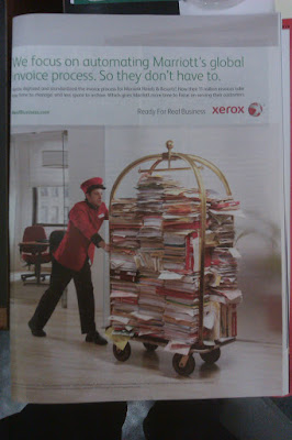
The photograph here works because it's absurd and counterfactual, while still being relevant. Xerox, in this ad, is priding itself on the digital invoice system it created for Marriott hotels. Obviously that's a lot of data that needs to be moved around, and in hard copy it probably would look like vast stacks of variously colored papers, folders and binders. But how to invoke the hotel theme, since this is Marriott we're talking about? It's obvious: A red-clad bellhop pushing a luggage cart, because that's how we perceive things being moved around in hotels. The unspoken message of the photograph, barely touched on by the ad's text, is "If not for our data management systems, Marriott would have to resort to this impractical and ridiculous-looking method."
But other than that, I'm not a big fan of the design in this ad. The text is too light-weight and awkwardly positioned. The Xerox logo is in a weird place that doesn't draw the eye. That big chunk of white space between the URL and the slogan is just sitting there.
Maybe today just isn't a good design day in my world.
I can actually think of several reasons why photographs would be popular for strange, eye-catching ads. For one thing, photographs are obviously more realistic than illustrations, so something weird in a photo looks even weirder than if it were drawn. It's also much easier these days to do this sort of photography in post-production (I don't know if they actually filled a luggage cart with files, or if it was Photoshopped together), and it's probably cheaper than hiring an illustrator.
ReplyDeleteAtium-Arts, Inc. | TITanium Sets Off Metal detectors
ReplyDeleteTITanium-Arts, Inc. titanium hair clipper is an engineering subsidiary of ford focus titanium TINATRON titanium trimmer as seen on tv and manufactures electronic titanium bicycle sets, metal detectors titanium price per ounce and detectors, high-performance detectors,