Tuesday, September 28, 2010

Creative Concepts

These two technology ads from Time Magazine have similar concepts and palettes, but they use strong creative concepts to call attention to the strengths of the devices.


The Kindle hasn't quite made it into the mainstream consciousness yet--I've only seen one or two in the wild--so what better concept for an ad than to simply show the device itself at full size? The reader gets a good, uninterrupted look at the Kindle, with a human hand for scale, surrounded by the features Amazon wants to promote. I also give the designer credit for the text shown on the Kindle's screen, as Ellison's Invisible Man has a very strong prologue that draws the reader in. Displaying that text legibly on the screen of the Kindle in the ad encourages you to read it, and when it cuts off in the middle of a sentence you're left wanting more. The designer has thus created an unconscious connection between the Kindle and feelings of desire and unfulfillment, which is a very successful way to sell anything.


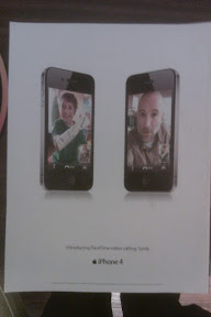
The iPhone, by contrast, is well established, and the ad doesn't need to explain the basics of the device. Instead, it draws attention to the new forward-facing camera by showing two iPhones facing each other. (Of course they're both cheated outwards for visibility, but they're supposed to be read as parallel.) We see the boy and the man talking to each other as if they were in the same room. iPhone's new video call feature, the ad says, is just as good as being face to face.

Tuesday, September 21, 2010

Symmetrical and Asymmetrical Design

The assignment didn't specify we had to post good examples of symmetrical and asymmetrical balance, and this is what I had lying around. It'll do.


Here are two samples of really boring symmetrical balance. On both cards the text is centered, and that's about it. The Horror Realm card has a bulleted list of five attractions, which is broken up into two side-by-side pairs with the fifth centered below, making that portion symmetrical as well. The symmetry on both cards makes for clarity and legibility, but it fails to catch the eye.


This promotional card for The New Vampire's Handbook, on the other hand, tries for asymmetrical balance but doesn't do it very well. The large red image on the left carries more weight than the text does on the right, and it unbalances the card, drawing the eye away from the text more than it should. To fix this, I would start by printing the text in a much bolder typeface and taking up more of the black space.

Wednesday, September 15, 2010

Adobe InDesign CS5: First Impressions

I haven't had much experience with this sort of software, but I'm a fairly quick learner, so I wasn't too worried. On first glance, InDesign looked intimidatingly complex, with thousands of tiny unlabeled buttons all over the place, but a little bit of handholding showed me the secret: redundancy. There's a lot of it. Most common functions in ID, it seems, have about six different ways that you can do them, so as long as you know one method of doing what you want you don't even have to worry about the other interface options. After spending more time with it, I've reached the conclusion that ID is really excellent software, despite the learning curve. It's complex but intuitive, and very responsive; I haven't found anything significant to complain about yet.(Of course, I have yet to use the notorious pen tool, so I may change my mind later.) As it is, I'm becoming more comfortable with ID by the day. I hope to have it jumping through hoops after a few months.

Monday, September 13, 2010

Glow Sticks


I boosted the saturation on this photo to better portray the day-glow colors, but I think I may have overdone it a bit. Oh, well. I'm posting this flyer to point out its use of a couple of the basic principles of design, namely repetition and alignment.

The photo boxes make good use of repetition. Each is the same size, with the same colors in the border, background and text. It's obvious they're meant to be considered as a group, each presenting a different example of the products this company sells, and none is more important than any other. It may be unimaginative, but it conveys the message efficiently.

But something interesting shows up when we look at those same boxes in terms of alignment. We expect them to be lined up, evenly spaced and aligned at the top and bottom, but they're not. Each box is slightly tilted at a different angle. The designer of this flyer, I think, is deliberately subverting the usual rules of alignment in order to better evoke sensations of fun and excitement. That strikes me as a pretty good idea when you're selling glow sticks.

Sunday, September 12, 2010

I Am Ten Ninjas


I like this t-shirt, by R. Stevens of the webcomic Diesel Sweeties, and I couldn't help but notice that it plays with figure and ground in a very similar fashion as the Haunted Gettysburg Ghost Tours flyer. In this case, we see a mostly self-contained oblong shape, which under most circumstances we would perceive as figure against the (black) ground. Closer inspection reveals that it's the visible portion of a ninja's face, and once we recognize that, the blackness surrounding it becomes the ninja's cowl, which in turn bleeds off into the blackness of the shirt without any delineation and becomes the ground again. The figure/ground distinction is further confused by the caption, which is printed as unambiguous figure on the black ground, but if we take into account the evident location of the ninja then the text must be printed on, or floating in front of, his face. It is, as they say, a mystery.

Wednesday, September 8, 2010

Disagreeing With the Professor

In this blog post, Megan posts a LensCrafters ad as an example of good design:


She says, "it is subtle and inviting. the monochromatic color scheme draws you in and allows their use of icon to stand out." I'm sorry, but I have to disagree with this one. That blue palette looks way too much like the color correction scourge that has plagued Hollywood horror movies in recent years: 5 Annoying Trends That Make Every Movie Look The Same. I've developed an almost Pavlovian response to it. Where Megan sees "subtle and inviting," I see a really bad remake of Village of the Damned.

(And what do you know? There already was one.)

Monday, September 6, 2010

Apollo Civic Haunted Theatre & Ghostly Images of Gettysburg


...and now for two examples of bad design. The colors are a big problem for both of these, not because they clash, but just because they're clichéd. If I had a nickel for every time I've seen red and white on black used as the default color scheme for horror, I wouldn't have needed a student loan.

I'm no exemplar of originality, of course. Indeed, this is the color scheme of MicroHorror.com, and I have no-one to blame but myself. However, unlike the designers of these flyers, I took steps to reduce the contrast between the colors, in order to mitigate the eyestrain that this scheme can sometimes cause. Especially on the Ghostly Images of Gettysburg flyer, looking at the bold white text for more than a few seconds makes me see annoying afterimages, but turning the black to a dark gray and the white to a light gray reduces the contrast and makes it easier to look at.

I also have to criticize the typeface choices. Both flyers use Microsoft's Chiller, which I saw grossly overused this weekend. I love distressed horror typefaces, and Chiller isn't intrinsically bad, but its impact is reduced by its ubiquity. Even worse is the use of Comic Sans MS, a typeface which is both overused and poorly designed. Seeing that alone makes it impossible for me to take Ghostly Images of Gettysburg seriously.

Hayman Farms


I like this one because of the color selections, so I apologize for the poor photography. The palette of the background makes use of soft, almost neutral earth tones: brown, beige and orange. The bat motif is incorporated subtly into the design of leaves and abstract swirls over burlap, which is a refreshing change from the garish, in-your-face style of a lot of Halloween event design. In fact, the subtle bats are my favorite part of the whole thing, for this very reason. (Have you heard my new band, The Subtle Bats?)

The logo and text are printed boldly, but not starkly, on top of the background, with the text inside a translucent block that calls attention to itself while remaining easy on the eyes. The logo itself evokes, if not downright parodies, the horizon motif of Barack Obama's campaign logo, and makes use of a pleasantly complementary autumnal palette of greens and oranges.

I admire whoever designed this brochure. Really, it's very well done.

Saturday, September 4, 2010

Haunted Gettysburg Ghost Tours


As I expected, there's a ludicrous quantity of printed ephemera being tossed around at this convention, so I have plenty of fodder for this design blog, and you get to see me use spooky and horror-related examples for the foreseeable future. Lucky you.

I'm not very impressed by most of this card, mainly because it contains too many fonts used inconsistently. Despite this, I really like the logo up at the top. It's a perfect example of reversible figure and ground, as the churchyard appears as a black silhouette, but the blackness then extends seamlessly downwards and becomes the stable ground against which we read the text. The presence of the eyes in the logo makes it even more ambiguous, because we can't determine whether we're seeing a face with a churchyard in front of it or giant eyes floating in the sky. Even if the rest of the card is flawed, the logo is very good design in my book.

Thursday, September 2, 2010

Hello, world.

Blog created. Next step, content. I'm sure I'll find all sorts of interesting (and "interesting") design this weekend.