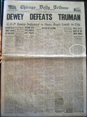
This, of course, is the legendary November 3, 1948 edition of the Chicago Daily Tribune. It's an example not only of the dangers of rushing to press, but also of obvious grid design.
Newspapers almost always have clearly identifiable grids, as a standardized grid structure makes it much easier to lay out the publication in limited time. This was even more true in the era of Linotype, before computers automated much of the process. In the Daily Tribune, we see a very straight, column-based grid into which any sort of articles can be slotted with minimal effort.
What I find most interesting is the number of columns. While six columns is usually the maximum you'll find today in any type of publication (the Baltimore Sun currently bases its grid around four columns), here we have eight. This allows the paper to save space by laying the headlines across the top and letting them serve almost as an index: scan from left to right to find the article you want to read, and then proceed down. The drawback is that the columns are exceedingly narrow and the page becomes quite dense with text, but this was much less of a concern at a time when the primary mission of a newspaper was to convey information to its readers.
[Image via Todd And(rlik)]
this is insane. I mean I understand the purpose of a good grid, but I don't think I can read anything that looks so texty either. I am glad we have found a happy medium with today's publications.
ReplyDelete