Tuesday, November 30, 2010

Xerox b/w Marriott

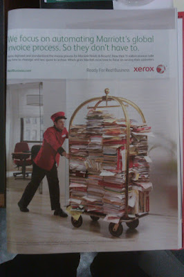
I'm perfectly willing to admit that maybe it's just me. Maybe I'm tired and preoccupied, and I'm overlooking all sorts of instances of great design all around me. It's definitely a possibility. But then again, maybe it's the case that most design I see just sucks (haphazard layout, no consistency in type or illustration, lack of direction), and the reason I'm not finding anything excellent is because there isn't any to be found. So here's a Xerox ad from Time Magazine, the strength of which comes almost entirely from a cleverly conceived photo.


The photograph here works because it's absurd and counterfactual, while still being relevant. Xerox, in this ad, is priding itself on the digital invoice system it created for Marriott hotels. Obviously that's a lot of data that needs to be moved around, and in hard copy it probably would look like vast stacks of variously colored papers, folders and binders. But how to invoke the hotel theme, since this is Marriott we're talking about? It's obvious: A red-clad bellhop pushing a luggage cart, because that's how we perceive things being moved around in hotels. The unspoken message of the photograph, barely touched on by the ad's text, is "If not for our data management systems, Marriott would have to resort to this impractical and ridiculous-looking method."

But other than that, I'm not a big fan of the design in this ad. The text is too light-weight and awkwardly positioned. The Xerox logo is in a weird place that doesn't draw the eye. That big chunk of white space between the URL and the slogan is just sitting there.

Maybe today just isn't a good design day in my world.

Sunday, November 28, 2010

ID, Ps and Ai in concert

By class time, Monday, November 29th, post a blog about how you would use all three programs, InDesign, Photoshop and Illustrator together to produce a newsletter. Think about the newsletter you produced for 502. How you would you [sic] use each program to produce your final product?

It doesn't take much creative thinking to use these programs to produce a newsletter, since that's exactly the sort of project for which they were created. All you have to do is know which program is best suited for which task: Photoshop is for creating and editing raster images such as photographs, Illustrator is for creating and editing vector images, and InDesign is for layout.

If your newsletter needs a logo or masthead design, Illustrator is the program to use. If I had had more (read: any) experience with Illustrator when I was working on The Bleeding Edge for 502, I would have used it to create the masthead instead of doing it entirely in InDesign.

Photoshop, as its name implies, is most likely to be used for processing and editing photographs. You probably have some that you want to use, but the colors may be washed out or similarly imperfect. You can use Photoshop for quick and easy color correction and make the whole newsletter look better, just as I did on the 502 project.

Finally, once all of your graphic work is done, you can bring it into InDesign. InDesign will let you set the text and produce whatever layout you want, arranging it with images and making it all look nice. Naturally that's what I used for the layout of The Bleeding Edge.

So it's not a big deal to use these programs for a newsletter. It's just a matter of knowing which is the right tool for the job.

Tuesday, November 16, 2010

Apple Redux

This assignment wasn't easy for me, since most of the well branded companies I admire are too small to advertise outside of their fields. (I love your logo, Raw Dog Screaming Press!) So I'm recycling content and using an ad I already discussed in this post back in September, but Apple is a very well branded company and this ad makes good use of that. I'm going with it.


This particular ad relies on the viewer's familiarity not only with the brand, but with the product. There's very little specific information in the ad, only what's necessary to point out the new feature. Instead, we see the iPhone, and we're meant to instantly recognize it and know who produces it, which is why the Apple logo itself only appears, small, at the bottom of the page. That's a perfectly valid choice for a brand as established as Apple, though. Assuming the viewer's familiarity and skipping the introductions sends an air of confidence. Apple wants to be seen as both familiar and strong, and that comes through in this ad.

Tuesday, November 9, 2010

Good logos, bad logos


The Sherwin Williams paint logo has always been one of my favorites, just because of its boldness of concept. What other corporate logos come right out and say "We want to conquer the entire planet"? They're not even carefully brushing the paint on the globe, either; they're just dumping the whole can. It's brash and unforgettable, while still remaining relevant to the company's actual product. If Sherwin Williams ever rebrands to something shiny and abstract, I will be a very sad fellow.


Good old Amazon. The smile/arrow has become one of the most iconic images of online commerce, recognizable even when separated from the company name. As a smile, it evokes positive emotion, and as an arrow it relates to travel and movement, very much a part of Amazon's shipping-based business model. But it becomes even more impressive as part of the full logo, because of something I didn't even notice for years. Look at where the arrow begins and ends. That's right: it travels from A to Z. It encompasses everything, just like Amazon's inventory. What a brilliant concept.


This... this is not so good. Remember America Online? Turns out the company still exists, and they recently tried to rebrand as "Aol." And yes, the period is part of the name. (How do you even pronounce that? "Owl"?) To make an Aol. logo, apparently you just print the name in white Helvetica, knocked out of whatever stock photo you have lying around, and you're done. Other companies have succeeded with variable, dynamic logos before, but this conveys absolutely no information about what the company does. Worse yet, it may even convey less than nothing, since it gives the impression that not even the company itself knows why it exists. (Something to do with goldfish?)


And finally, the infamous logo of Brazil's Institute of Oriental Studies, widely considered to be one of the worst logos of all time. Technically it's not so bad; the colors aren't too garish, and the simple linework means that it's easily scalable. It does, however, violate one of the most fundamental rules of logo design: Don't make your logo look like something obscene is going on. If you can look at this logo and see nothing but a pagoda in front of a setting sun, well, I envy your innocence.
Tuesday, November 2, 2010

Good color, bad color


More horror, hooray! This is a card advertising an independent movie, and I thought the color choices were pretty effective. I wish the image were better, but once again I'll make do. This card uses the typical "horror palette" of black, white and red, but the exceptional brightness of the fork draws the eye. The remainder of the card is relatively subdued, and I think the contrast between the shining fork and the dim text adds some tension and keeps the viewer engaged.


This is actually the backside of the "Scream Freak" card from this post, and it's just plain ugly. The colors are obscenely bright, and the contrast along some edges is painful to look at, causing a "vibration" illusion in some spots. Of course, this is the printer's self-promoting side of a free card, so perhaps it functions as a sort of extortion: "Pay up, and we won't put this hideous thing on the back of your postcard!"